RFM Model Timelapse
May 19, 2019 #gganimate #ggplot2
A simple exercise of plotting RFM (recency, frequency, monetary) model and using gganimate to add a cherry on top.
Dataset: Dr Daqing Chen, Director: Public Analytics group. chend ‘@’ lsbu.ac.uk, School of Engineering, London South Bank University, London SE1 0AA, UK.
httr::GET(
  "https://query.data.world/s/eibmlnrvn7hzil7adpfqceeity3im6",
  write_disk(tf <- tempfile(fileext = ".xlsx"))
)## Response [https://download.data.world/file_download/uci/online-retail/Onlinex?auth=eyJhbGciOiJIUzUxMiJ9.eyJzdWIiOiJwcm9kLXVzZXItY2xpZW50OnRtYXMtamMiLCJpc3MiOiJhZ2VudDp0bWFzLWpjOjoyZDJkOGFjYy0yMDAwLTQ0NWQtOWVlZS02YTZlNDQ5MzI4MzMiLCJpYXQiOjE1NTc5NzQ0NTksInJvbGUiOlsidXNlciIsInVzZXJfYXBpX2FkbWluIiwidXNlcl9hcGlfcmVhZCIsInVzZXJfYXBpX3dyaXRlIl0sImdlbmVyYWwtcHVycG9zZSI6ZmFsc2UsInVybCI6IjJlZWY3ZTEwMzllNmU5NjRiNTdlZDdhNTJiNzYyNmVkNzM0NjM4M2YifQ.TH1yJ7mMLNo8jDJs_EAiuwEh4JJlQELaMJ_aJVVEKgyYYdiy-h_N56sgGbm1p8y1BIBaI3iFNM7yFwiGLE9Qpg]
## Date: 2020-06-27 04:19
## Status: 200
## Content-Type: text/html
## Size: 23.7 MB
## <ON DISK> /var/folders/rb/681k99k555dc_b11rqpzf3100000gn/T//Rtmpki8di5/file1623c5687345b.xlsxraw <- read_excel(tf) %>% clean_names()# select important features
dat <- raw %>%
select(customer_id, invoice_no, invoice_date, unit_price, quantity) %>%
mutate(total_paid = unit_price * quantity,
invoice_date = lubridate::as_date(invoice_date)) %>%
rename(date = invoice_date, invoice = invoice_no)
# count in recency, frequency, and monetary
d <- max(dat$date)
dat <- dat %>%
group_by(customer_id) %>%
summarise(rec = time_length(interval(d, max(date)), "days"),
freq = n_distinct(invoice),
monet = sum(total_paid)) %>%
mutate(rec = abs(rec), monet = monet / freq) %>%
# only keep positive amount
filter(monet >= 0)## `summarise()` ungroup (override with `.groups` argument)# EDA ------------------------------------------------------------
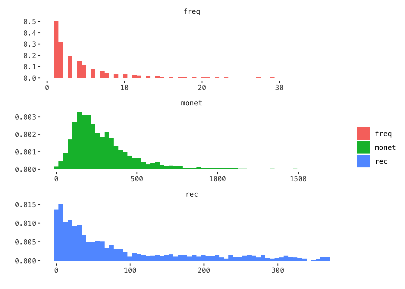
dat %>%
gather(var, val, -customer_id) %>%
group_by(var) %>%
# remove outliers
filter(val <= quantile(val, 0.99)) %>%
ggplot(aes(val)) +
geom_histogram(aes(y = ..density.., fill = var), bins = 60) +
facet_wrap(~ var, scales = "free", ncol = 1) +
labs(x = "", y = "", fill = "")
# binning
df <- dat %>%
    filter_at(.vars = c("rec", "freq", "monet"), all_vars(. <= quantile(., 0.99))) %>%
    mutate(freq_bin  = Hmisc::cut2(freq, g = 6),
           rec_bin   = Hmisc::cut2(rec, g = 3),
           monet_bin = Hmisc::cut2(monet, g = 9))

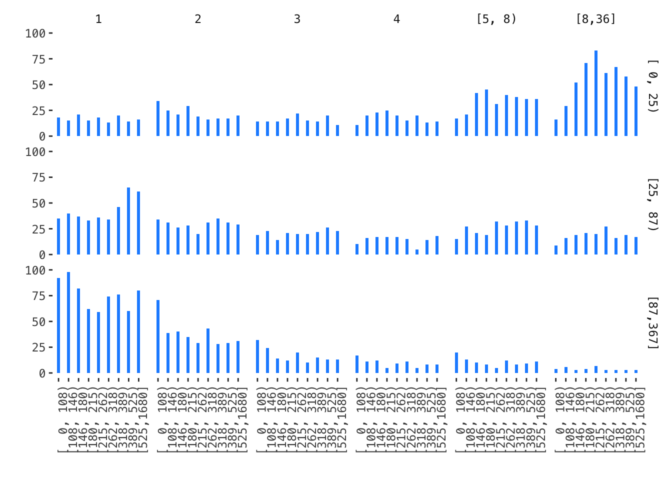
# facet histogram
df %>%
    ggplot(aes(monet_bin)) +
    geom_bar(stat = "count", width = .3, fill = "dodgerblue") +
    facet_grid(rec_bin ~ freq_bin) +
    theme(axis.text.x = element_text(angle = 90))  +
    labs(x = "", y = "")
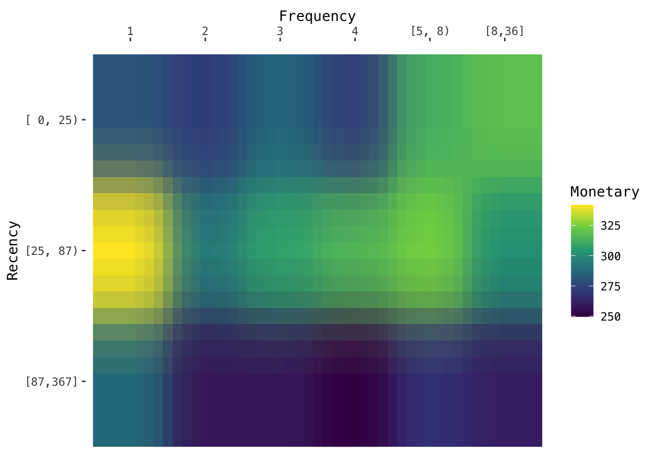
# heatmap
df %>%
    # collapse data frame to add 'm'
    group_by(freq_bin, rec_bin) %>%
    summarise(mean = mean(monet)) %>%
    ungroup() %>%
    mutate(ind = 1:n()) %>%
    ggplot(aes(freq_bin, fct_rev(rec_bin), fill = mean)) +
    geom_raster(interpolate = TRUE) +
    scale_x_discrete(position = "top") +
    #scale_fill_brewer(type = "seq") +
    scale_fill_viridis_c() +
    labs(x = 'Frequency', y = "Recency", fill = "Monetary")
## `summarise()` regrouping by 'freq_bin' (override with `.groups` argument)
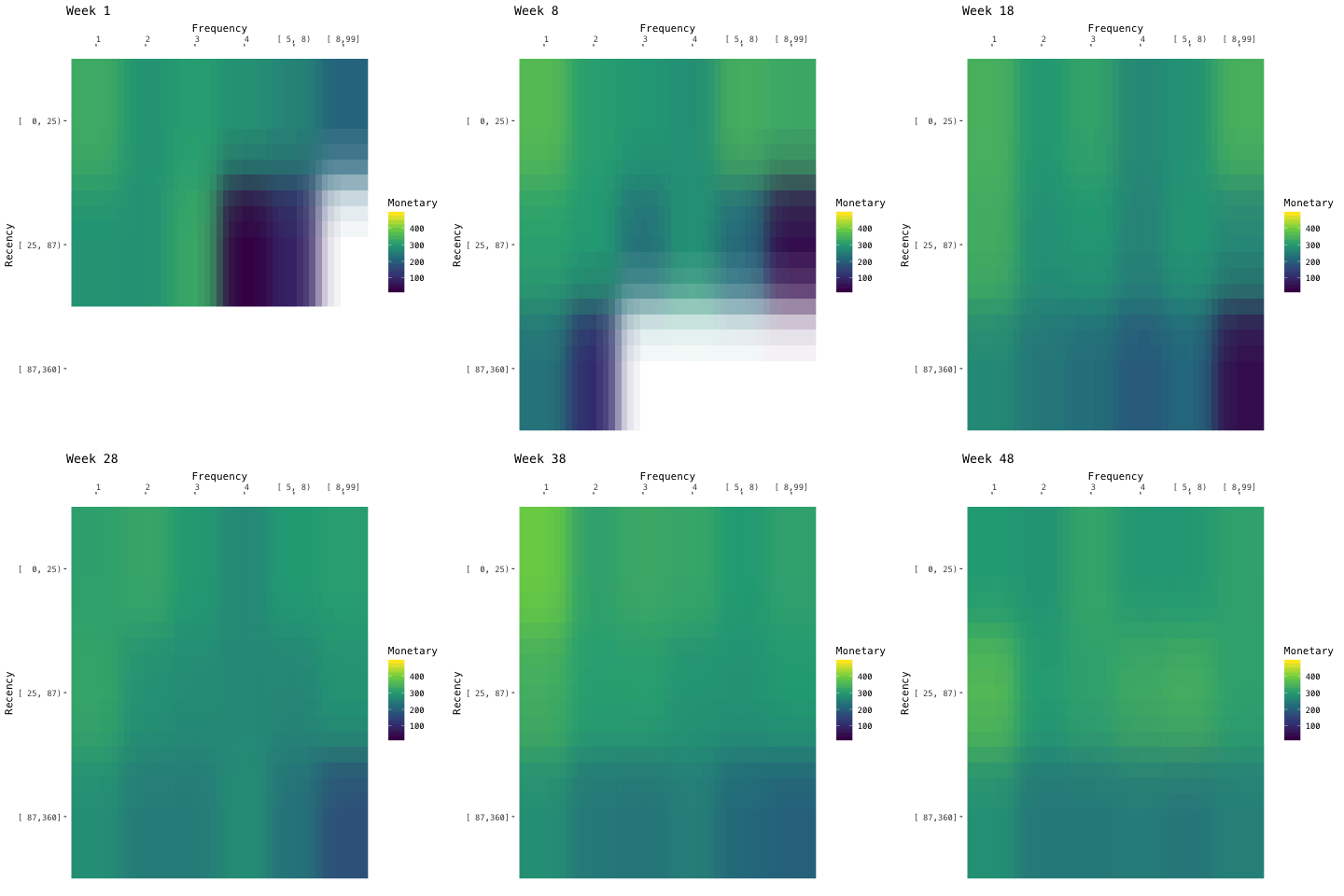
The moving RFM model by week.
# make series of time points
ds <- seq.Date(as.Date("2011-01-01"), as.Date("2011-12-01"), by = "week")

# make series of rfm snapshots
long_dfs <- purrr::map(ds, ~ {
    raw %>%
        mutate(total_paid = unit_price * quantity,
               invoice_date = lubridate::as_date(invoice_date)) %>%
        filter(invoice_date <= .x) %>%
        group_by(customer_id) %>%
        summarise(rec = time_length(interval(.x, max(invoice_date)), "days"),
                  freq = n_distinct(invoice_no),
                  monet = sum(total_paid)) %>%
        mutate(rec = abs(rec), monet = monet / freq) %>%
        # only keep positive amount
        filter(monet >= 0) %>%
        filter_at(.vars = c("rec", "freq", "monet"), all_vars(. <= quantile(., 0.99))) %>%
        # must be fixed interval
        mutate(freq_bin = Hmisc::cut2(freq, cuts = c(1, 2, 3, 4, 5, 8, 99)),
           rec_bin = Hmisc::cut2(rec, cuts = c(0, 25, 87, 360)),
           monet_bin = Hmisc::cut2(monet, cuts = c(0, 108, 146, 180, 215, 262, 318, 9999)))
})

# tidy up long data frame above
long_dfs <- long_dfs %>%
    bind_rows(.id = "m") %>%
    mutate(m = as.numeric(m)) %>%
    mutate_at(vars(contains("bin")), as.factor) %>%
    # collapse data frame to add 'm'
    group_by(m, freq_bin, rec_bin) %>%
    summarise(mean = mean(monet))

# make animation
anim <- long_dfs %>%
    ggplot(aes(freq_bin, fct_rev(rec_bin), fill = mean)) +
    geom_raster(interpolate = TRUE) +
    scale_x_discrete(position = "top") +
    #scale_fill_brewer(type = "seq") +
    scale_fill_viridis_c() +
    # make animation here ----
    labs(x = 'Frequency', y = "Recency", fill = "Monetary",
         title = "Week {closest_state}") +
    transition_states(m, transition_length = 1, state_length = 5) +
    ease_aes('linear')
#anim_save(animation = anim, filename = "moving_rfm.gif", path = "content/etc")