Bar, Bended Bar, and Treemap
Jan 21, 2018 #ggplot2 #drivethru
In this exercise, we will visualize Standard & Poor’s 500 Index industry composition.
Gettting sp500_sectora
We will scrap the sp500_sectora from Wikipedia page, with rvest.
library(dplyr)
library(rvest)

url <- "https://en.wikipedia.org/wiki/List_of_S%26P_500_companies"

sp500 <- url %>%
    read_html() %>%
    # How do I select css?
    html_node(css = "table.wikitable") %>%
    html_table() %>%
    mutate(sector = factor(`GICS Sector`)) %>%
    as_tibble()
sp500
## # A tibble: 505 x 10
## Symbol Security `SEC filings` `GICS Sector` `GICS Sub Indus… `Headquarters L…
## <chr> <chr> <chr> <chr> <chr> <chr>
## 1 MMM 3M Comp… reports Industrials Industrial Cong… St. Paul, Minne…
## 2 ABT Abbott … reports Health Care Health Care Equ… North Chicago, …
## 3 ABBV AbbVie … reports Health Care Pharmaceuticals North Chicago, …
## 4 ABMD ABIOMED… reports Health Care Health Care Equ… Danvers, Massac…
## 5 ACN Accentu… reports Information … IT Consulting &… Dublin, Ireland
## 6 ATVI Activis… reports Communicatio… Interactive Hom… Santa Monica, C…
## 7 ADBE Adobe S… reports Information … Application Sof… San Jose, Calif…
## 8 AMD Advance… reports Information … Semiconductors Santa Clara, Ca…
## 9 AAP Advance… reports Consumer Dis… Automotive Reta… Raleigh, North …
## 10 AES AES Corp reports Utilities Independent Pow… Arlington, Virg…
## # … with 495 more rows, and 4 more variables: `Date first added` <chr>,
## # CIK <int>, Founded <chr>, sector <fct>Note: Write a post about rvest node selector.
Pie Chart
Let’s begin with an awful pie chart.
library(ggplot2)
library(RColorBrewer)

# Set ggplot theme
old <- theme_set(theme_light() + theme(legend.position = "bottom"))

# Set colour palette for repeated use
pal <- scale_fill_brewer(
    palette = "Set3",
    guide = guide_legend(
    title = "Sector",
    title.position = "top",
    label.position = "top",
    keyheight = 0.5,
    ncol = 4
    )
    )

# Pie Chart
sp500 %>%
    ggplot(aes(factor(1), fill = sector)) +
    geom_bar(width = 1) +
    # Pie chart is simply a change in the polar coordinate
    coord_polar(theta = "y") +
    labs(x = "", y = "Count") +
    pal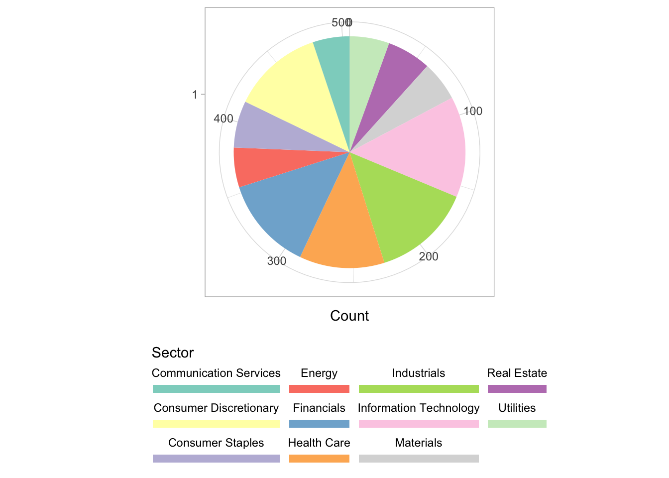
The disadvantage of using a pie chart is that we cannot clearly visualize the differences, e.g. how much difference is there between the biggest and second biggest industry?
Bar Chart
We should be quite familiar with this.
# Summarize sector by count
sp500_sector <- sp500 %>% group_by(sector) %>% summarise(n = n())

# Normal Bar Chart
sp500_sector %>%
    ggplot(aes(reorder(sector, -n), n, fill = sector)) +
    geom_bar(stat = "identity") +
    # We hide axis x text
    theme(axis.text.x = element_blank()) +
    # and manually replace with geom_text
    geom_text(aes(y =  n/2, label = sector),
              show.legend = FALSE,
              angle = 90,
              size = 3,
              nudge_y = +20) +
    labs(x = "", y = "Count") +
    pal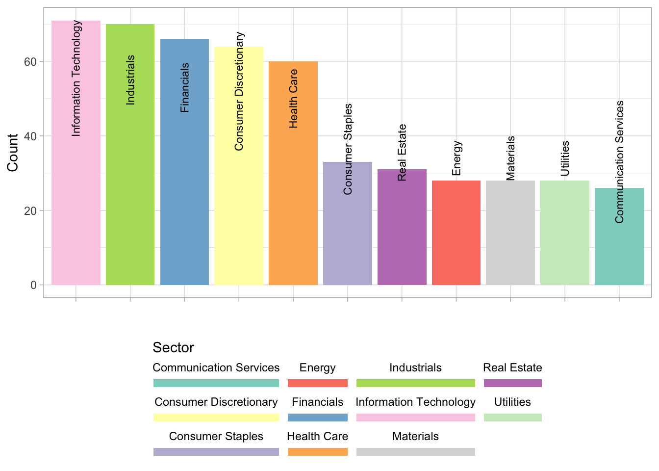
Polar Bar Chart
What if we bend the bars? (Inspired by Apple Watchface)
# The Circular Bar Chart Way
sp500_sector %>%
    ggplot(aes(reorder(sector, n), n, fill = sector)) +
    geom_bar(stat = "identity") +
    # Expand the breaks & limit to look nicer
    scale_y_continuous(breaks = scales::pretty_breaks(10),
                       expand = c(0, 0.8)) +
    coord_polar(theta = "y", direction = 1) +
    labs(x = "", y = "Count") +
    pal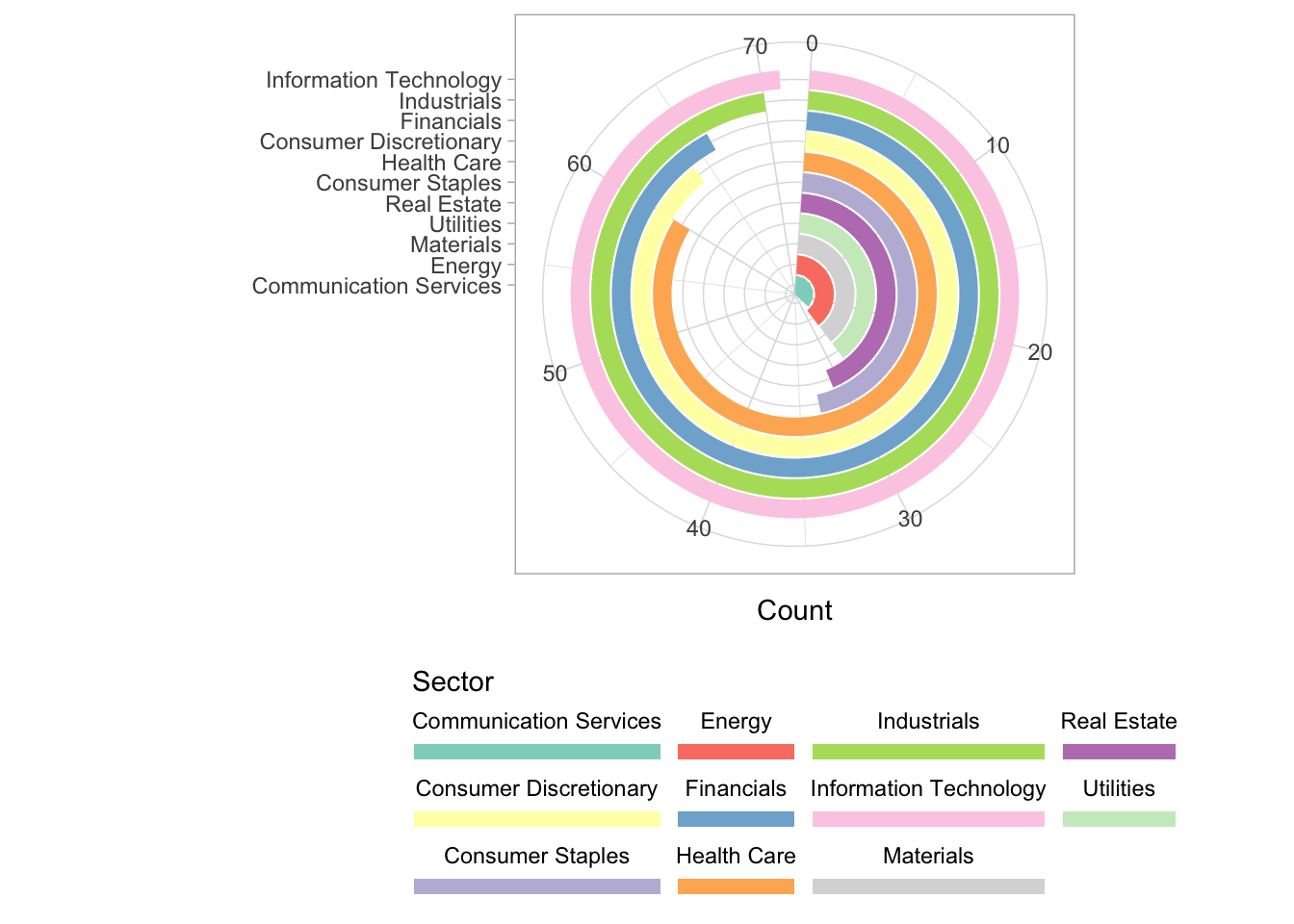
The main benefit is that we get a more organized display of sorted ranking. Not bad.
Treemap
In my opinion, Treemap is good when you wish to zoom into a particular group of objects. In our case, attention is drawn to the biggest industries. Treemap is also space-efficient. Legend and axis labels are often expendable.
library(treemapify)

sp500_sector %>%
    mutate(pct = scales::percent(n / sum(n))) %>%
    ggplot(aes(area = n, fill = sector, label = paste(sector, "\n", pct))) +
    geom_treemap(show.legend = FALSE) +
    geom_treemap_text(place = "centre", size = 9) +
    pal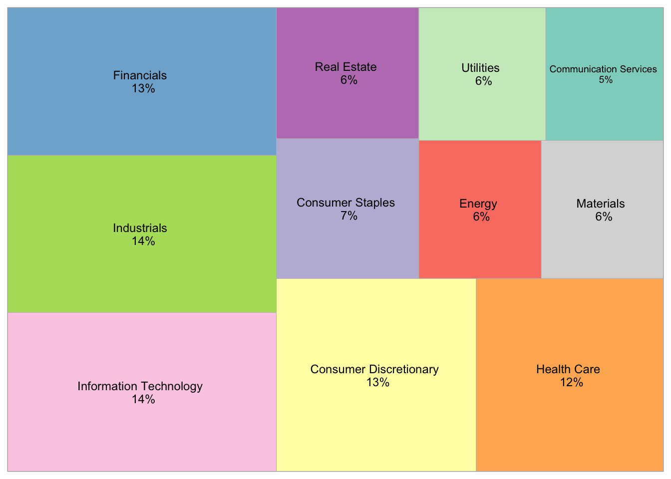
That’s it. A quick 10. Till next time.